- Fabric stores often have sales and great deals can be found on fresh stocks of your favorite fibers. This is of course ideal because you know what you're getting and can often choose from a bewilderingly varied assortment.
- Thrift stores don't label the fabric by content; an employee (who probably doesn't know anything about fabric) sees that it's fabric, throws it on a hanger or rolls it up with some tape, and gets it out onto the sales floor. For someone like myself who is fairly new to all of this, I'm usually left wondering what a fabric might actually be, what laundering it may require, how I should sew it and what it would best fashion, etc.
My friend Janet calls thrift store fabric Mystery Fabric. For some reason I have always thought this is hilarious. It's actually quite apt but I think the humor is that I have so much of it and I don't know what most of it is. However, I'm at the point where I can recognize 100% cotton by look and feel, meaning I'm getting better at recognizing blends. Like anyone learning, I've made some horrendous purchases but I am now walking by fabrics I once would have thought were wonderful.
Lesson 1: As in anything else, knowledge is power. Since you can't do a burn test in the store without being arrested, learn to recognize fiber content by look, feel, drape, weave, color, and (if present) label. And when in a suburban thrift, don't drape the fabric around your head.
Over at Peter Lappin's blog Male Pattern Boldness, he recently revealed a rather smart-looking jacket he'd recently finished. While he likes the color, he asked whether it's a tomato red or more of a cranberry red as he wasn't sure. In looking at the pictures, I think it looks different depending upon the colors near it in the photos, the light (natural vs. artificial and the color and intensity of the light), and of course the camera, the browser, etc.
The same is true for fabric. Inspired by Peter's jacket, I found a red cotton poplin in a thrift store that I knew was a little bluer than his red twill but I didn't know by how much until I got it home and saw it in natural, incandescent, and LED light. It's not red, it's fuchsia and it's ugly.
Here is some mystery fabric of mine, all purchased from local thrifts at rock bottom prices. All are cotton and all are in the red spectrum. While all have the same basic hue, they aren't all primary and don't all share the same secondary or tertiary color categories.
Note: I haven't edited these photos except to increase fill light, as it's a cloudy day and it's 4:30 pm, so it's getting dark. The camera's setting is Auto Portrait. (I didn't care so much about setting up the camera manually for the best detail; rather, I just wanted to be consistent in all the shots so you could compare apples to, er, tomatoes. You know what I mean, right?)

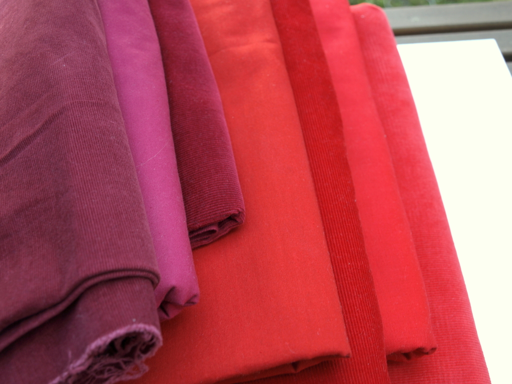
Yes, believe it or not, all of these fabrics looked red when I purchased them in thrift stores with fluorescent (and often low) lighting, next to other fabrics on the racks that bear no relation to each other, and questionable content. (These I'm pretty sure are all 100% cotton, however.) The fabric I purchased in response to Peter's red is the second from the left. Yep, that looked red in the store although I thought it was slightly bluer than his. It's not even close. Also, notice how the light in the second shot is brighter because the angle of my lens has changed. Notice also how the textures of the corduroy add shade to their colors due to the shadows cast by their wales.

Even their weaves affect color. On top (above) is a more open weave -- kind of a canvas plain weave but smooth like poplin. Between the two corduroys is a genuine poplin with a tighter weave. The open weave has fibers that are brighter than the poplin but because the poplin has less shade, it looks brighter in the picture. As for the cords, the one on bottom has a very slightly longer nap, though I would categorize it as only slightly wider than the pin wale in the middle. One might think this longer nap would add shade but in this case, it adds tint because the quality appears to be lower and at an angle more perpendicular to an individual wale there is a much lighter, even pinker color being cast by each tiny thread casting a white-ish tint.
These, obviously, aren't red. However, the poplin looked kind of cranberry red in the store, so I bought it.

The corduroy on bottom is actually the reddest of the three, yet in sorting through my mystery fabrics about a month ago, I thought it looked quite blue. That was because I stored it next to the denim, which was next to a coral-colored rayon. So the depth of the corduroy's nap and its locations played a role in how I perceived it.
Where is all this headed? Well, here's one direction. Here are some of the cotton plaids I've purchased from thrifts. Notice the differences in the reds:

From left to right, we have a genuine tomato red that looks brown/orange/rust due to the colors around it and the openness of its weave. To its right is tomato red thread being woven with blue threads (warp or weft, I can't tell from here), giving the red a deeper, blue-ish cast although the red thread hasn't changed its tomato color. Moving right is a bluer red that is also woven with a blue and a gold -- an interesting combination: next to the gold, the red looks more true red; next to the blue and green, it looks more wine-colored. The next plaid is an obvious red-blue tertiary, obvious despite the strong yellow vertical pattern woven close by. It is the bluest of all the reds here and despite the thread having great saturation, the weave makes it look more faded. Finally, the top plaid has the most saturated red and it too is a tomato or true red. However, it's woven with a yellow underneath and even next to the blues, it looks very bright and red. I also think the white gives the intersections of the vertical and horizontal red bands an especially intense character.
Lesson 2: When shopping for fabric in-person, try to view the fabric next to other fabrics that are both similar and different. Take the fabric to the window for a more natural light. Observe the weaves closely. Knowledge is power so learn the color wheel and learn your own best color story.
These "lessons" are really just notes to myself that I'm documenting on my blog. The vast majority of you probably know all this. It's mostly common sense, something a low price tag can obfuscate.
No comments:
Post a Comment